Data visualization
Data visualization is the process of representing data and information in a graphical or visual format such as charts, graphs, maps, and dashboards. It helps transform large and complex data sets into visuals that are easier to understand and interpret. By using visual elements, data visualization allows people to quickly identify patterns, trends, outliers, and relationships within the data. This makes it a powerful tool for decision-making, analysis, and communication in various fields such as business, science, and technology. Common types of data visualizations include bar charts, line graphs, pie charts, scatter plots, and heat maps. Tools like Microsoft Excel, Tableau, Power BI, and programming languages such as Python and R are widely used to create these visualizations. Overall, data visualization enhances our ability to understand data and communicate insights effectively.
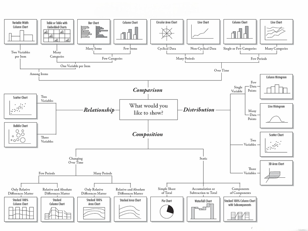
Types of Data Visualization
# Data visualization is the practice of representing information in a visual format so it’s easier to understand, analyze, and communicate. Different types of visualizations serve different purposes, and choosing the right one depends on your data and your audience.
1. Charts and Graphs
These are the most common visual formats. Bar charts are great for comparing quantities, line charts show trends over time, and pie charts help display proportions. Area charts, scatter plots, and histograms also fall under this category, each serving a specific analytical need.
2. Maps
Geographic maps and heatmaps help in displaying location-based data. They are widely used in sales reports, logistics, and demographic studies to show patterns and distributions across regions.
3. Infographics
Infographics combine text, images, and visuals to tell a story. They are useful when you need to explain a concept, process, or set of statistics in a more engaging way.
4. Dashboards
Dashboards present multiple data visualizations on one screen. They allow decision-makers to monitor key performance indicators (KPIs) in real time, making it easier to act quickly based on insights.
5. Interactive Visuals
Interactive charts and dashboards let users explore the data by clicking, filtering, or zooming in. This approach helps uncover patterns that might be missed in static visuals.
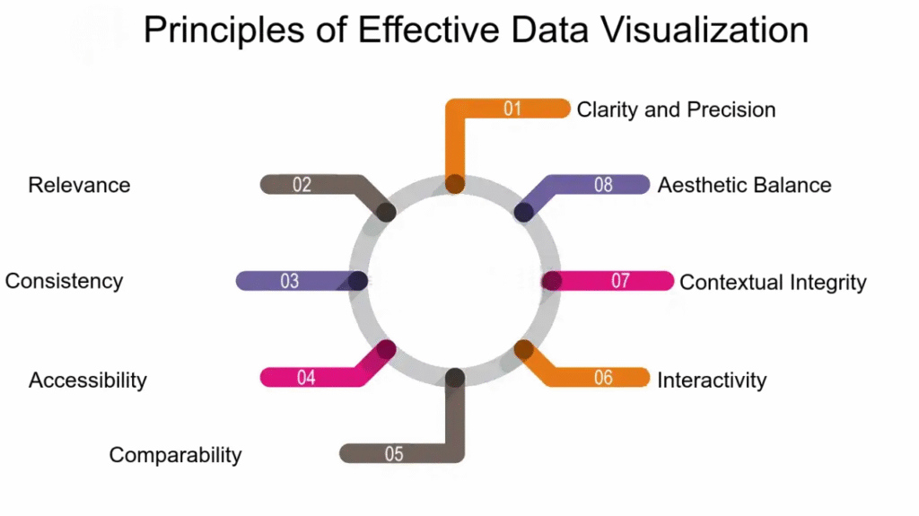
Principles of Effective Data Visualization
# Creating an effective data visualization goes beyond making it look attractive. It should communicate the message clearly, avoid confusion, and be meaningful to the audience.
1. Clarity
The primary goal of any data visualization is to convey information in the simplest form possible. Avoid unnecessary design elements that do not add value.
2. Accuracy
Visuals must reflect the true nature of the data. Misleading scales, disproportionate charts, or manipulated visuals can damage credibility and lead to wrong decisions.
3. Choosing the Right Format
Not every chart fits every dataset. Use a bar chart for comparisons, a line chart for trends, and a scatter plot for relationships between variables.
Infographics combine text, images, and visuals to tell a story. They are useful when you need to explain a concept, process, or set of statistics in a more engaging way.
4. Use of Color
Colors should guide attention and separate data groups without overwhelming the viewer. Limit the palette and ensure it’s accessible for people with color vision deficiencies.
5. Audience-Centered Design
Always consider who will view the visualization. Technical audiences may prefer detailed charts, while general audiences might need simpler, more explanatory visuals.
6. Consistency
Maintain uniform styles, fonts, and color schemes across multiple visuals to make them easier to follow.
.
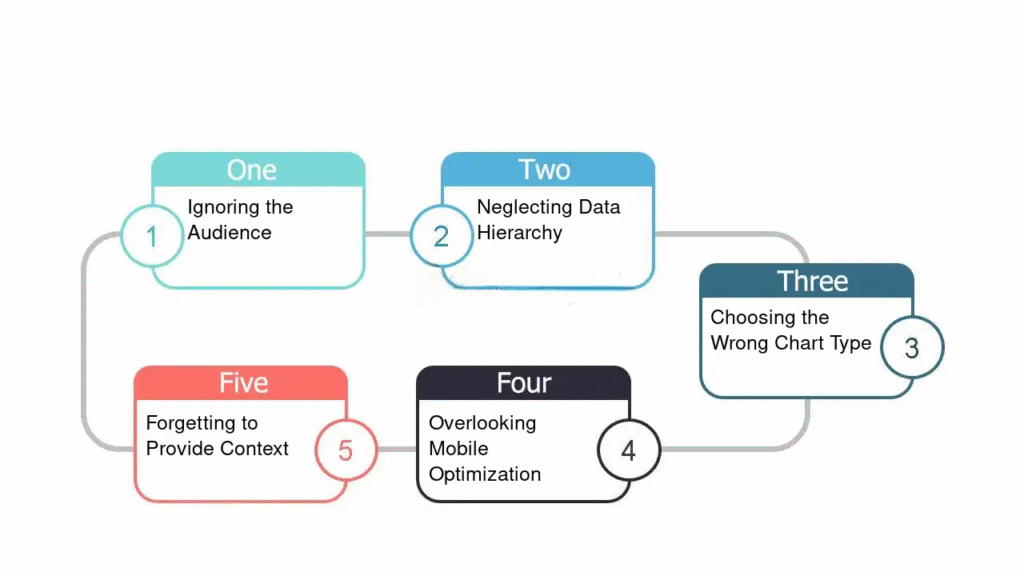
Common Mistakes to Avoid
# Even with the best data, poor visualization choices can reduce impact and clarity. Here are frequent errors to watch for:
1. Overloading with Information
Trying to show too much data in one chart can overwhelm the audience. Focus on the most important insights.
2. Poor Color Choices
Overly bright or clashing colors can distract from the message. Choose a balanced, purposeful palette.
3. Inaccurate Scaling
Changing the scale of a graph to make changes appear more dramatic or less significant is misleading and can erode trust.
Infographics combine text, images, and visuals to tell a story. They are useful when you need to explain a concept, process, or set of statistics in a more engaging way.
4. Ignoring Context
Data without proper context may lead to false conclusions. Always label axes, note data sources, and provide explanations where needed.
5. Overcomplicated Design
Adding unnecessary effects, 3D elements, or excessive decoration can distract from the actual insight the data provides.
Conclusion
Effective data visualization turns numbers into stories that drive understanding and action. By choosing the right type of visual, following core principles, and avoiding common mistakes, you can create presentations that are both informative and engaging. Whether for business, education, or research, clear and accurate visuals make decision-making faster and more reliable.